
Liam Olson
Inspired to design with people in mind.
Let's make change.
Some of My Projects!






Accessibility Student Advisory Board Branding
The Student Government Accessibility Student Advisory Board was established to support the needs of the community at Rochester Institute of Technology (RIT) who benefit from accommodations.

Background
The Accessibility Student Advisory Board (ASAB) is a piece of the Student Government umbrella, a space for the student body to have their voices heard and provide input on charged Pawprint petitions or impactful decisions. Their goal is making information, supports, and the college campus more accessible by considering perspectives.
Prompt & Goal
In the Spring of 2026, ASAB did not have any defined outlines for their work. Student Government itself often goes under the radar for many students— most the student body doesn't know what they do. ASAB was in the same boat: it had no recognizable identity.As such an important board for students with disabilities to speak, I offered to help design a logo to the acting Senator. I wanted to highlight the values of accessibility— usability, access, resilience, and community.


Logo Sketches, Illustrator File progress, and Final proposed designs
Process and Challenges
Accessibility itself is a difficult contain in one symbol because there are so many kinds of disabilities. I was hoping to design a more inclusive logo but I found it difficult to ideate something outside of the typical disability designs. After sketching various concepts during the summer, I proposed 7 different designs to our new board to choose.
Outcome
ASAB’s logo is inspired by the national logo for web accessibility, with a softer, more friendly approach. Disabled students at RIT should feel comfortable and supported by SG to stand up for their rights as students. This logo embodies the most important message— at the end of the day, we are all human.


Various examples of Instagram Content designed to align with the brand
Awareness
With the board's main value covering accessibility, it means I needed to pay extra attention to making the design and outlines of the work accessible for everyone while following the guidelines that RIT has set for their branding.Various examples of staying conscious was choosing our primary color, creating designs that were clean, outlining typography rules, and addressing concerns with ALT text, captioning instructions, and following Government WCAG guidelines.
ASAB's final design in various formats


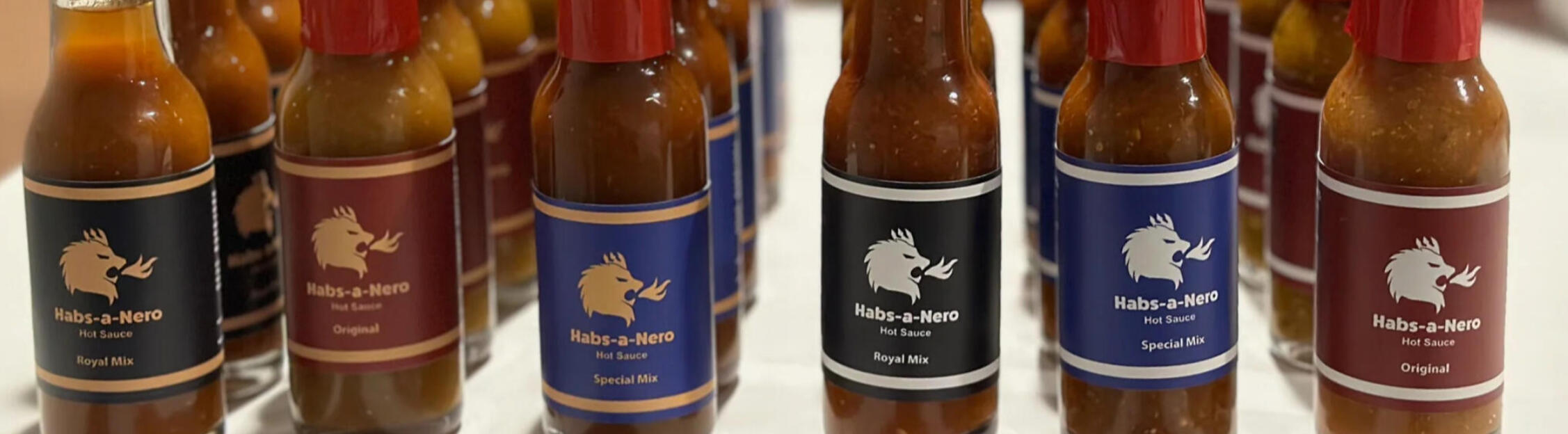
Habs-A-Nero Hot Sauce Branding
With the creators of Habs-A-Nero, I worked to capture the regal Ethiopian identity of the hot sauce. I was tasked in designing a logo, labeling, and applying design principles.
Background
Habs-A-Nero is a homemade Ethiopian-inspired small batch hot sauce made in Evanston, IL. It has become popular among many and there are plans to sell at the Evanston Farmers' Market in coming years.
Deliverables & Goals
Develop a Logo that embodies the product and origin
Use Color, Iconography, & Typography to differentiate flavors and consistencies of the sauce
Create Package Labels that kept customers informed for the product and contents
Time Frame
May 2020 – July 2020Brand Refresh in June 2026


Redesigned logo and a small branding page
Redesign
In the summer of 2026, I revisited the Habs-A-Nero branding to clean up the work I did. I've found that modifying and improving older designs is important to make a brand cleaner, relevant, and reflect on the progress I've made since then. With Habs-a-Nero being my first professional project, I knew it would be important to improve it.


Current designed labeling and deliverable package for customers
Strategy and Change Marketing & Publication
With the book authors, I designed various marketing materials and in-book designs. I contributed to the book cover by providing ideation concepts but it was designed by Wiley and Sons.

Background
Strategy and Change by Aaron K. Olson, Ward Ching, Richard Waterer, and BK Simerson, Ed.D., is a practical guide to developing strategic leadership skills and helping readers make informed decisions and navigate risk in today’s unpredictable work environments.
Deliverables
Book Illustrations
Marketing Materials for Amazon and LinkedIn
Workbook Content and Infographics
Web Design via Squarespace
Time Frame
January – August 2025Book release in September 2025


Various LinkedIn marketing posts that discuss some of the information within the book

Example of a mockup design provided and the final work for the book I produced


Examples of a final book illustration, Amazon advertisement panels, and a informational poster
HIVE Center Rebrand Project
For my college class Branding Systems, I was prompted to choose an active non-profit organization and create a unified branding system. The deliverables included a logo, color palette, elements, typography, business cards, a web layout, and a logo animation.
Background
HIVE Center for the Book Arts is a non-profit organization focused on the education and accessibility of book arts and fostering creativity. They promote to those looking for connections through the various mediums pertaining to book arts.
Deliverables
Iconographic and Typographic Logos
10-second Animated Logo
Secondary Assets & Elements
Website Landing page
Business Card
Time & Class
August 2026 – October 2026Academic Project: Redesigning an Organization

Early stage Logo sketches and iterations
Process and Challenges
In this project, I originally wanted to pull from the more friendly parts of the organization, and what could be more friendly than a cute bee? A lot of my first sketches for the logo was centered around the bee and illustrating creativity.When I showed this off in my first critique, I got a lot of feedback that it was a little too straightforward, in my style, and didn't really connect to the idea of what book arts was.The challenge with HIVE is that although Book Arts and printing design is considered more historic, their space and feel is so modern. I had insider knowledge, having been to the studio multiple times, but my peers had never seen what their space looked like. They recommended I expand my ideas broader.


Various pieces of branding content developed: A Business Card, Main Webpage, Logos, and Post design example
Small Projects
Smaller design projects I've worked on for freelance, non-profit, and practice.

TigerGuides Web
Website full of RIT-related tools (many student-made) and helpful information for incoming and current students to use. Designed for easy access and made with Carrd + Light HTML Coding.

RIT Loreboratory
The RIT Loreboratory is a potential research hub for folklore and history-related studies. The logo was designed to mirror lion iconography of medieval times.

TunnelVisionaries Mural Mockup
A mural for the TunnelVisionaries club to welcome students and tours to the RIT Residence Hall tunnels.

Design Stickers
I often am designing stickers regularly, from playful pieces to more powerful statements. I use it as a way to unify others and have fun with my design work.
Illustration & Art
I started my career in the art field doing illustration. As I transitioned to digital work, I began to make illustrations and branding for content creators.


Photo, Video, & Motion
I have some light experience in Photography, Video, and Motion Design! I've taken classes and taught myself more about these subjects.


Trans & Queer Identity through Social VR Project

Poisonous Foods for Cats Motion Project

Indian Folklore Story Motion Project
About Me
What I do
Accessible & Inclusive Design
I prioritize contrast, and usability, integrating accessibility practices into designs. All people, regardless of their abilities, deserve to understand the world clearly.
Brand & Visual Identity
Creating cohesive design systems, including logos, typography, color palettes, and visual standards that help brands communicate their visions.
Marketing & Promotional Design
Designing promotional materials such as posters, social media graphics, infographics, and digital advertising assets to appeal to target audiences.
Web & User Experience
Making experiences clear, compelling, useful, and accessible to the work I do. Doing user research to know the most about what makes a good platform.
Illustration & Digital Art
Using illustration as a way to engage users in promotional materials, social media content, and as reusable assets for brands and content creators.
My Story
Art has been my passion from as early as I can remember. Even in kindergarten I was always making things, from making my own street sweeper with cardboard and a bike, to doodling in classes, and always thinking outside the box as to what I could do to make life colorful.In high school, at Evanston Township, I began taking Graphic Design classes. This allowed me to get early feedback and establish a groundwork for who I am as a designer today. When I went to college at Rochester Institute of Technology, I was able to apply the skills I had while continuing to learn new ones.I came to RIT for a part of my academics, minoring in American Sign Language and Deaf Culture at National Technical Institute for the Deaf (NTID). I never knew what made ASL so interesting to me until I was in my sophomore year and an experience I had made me realize how much accessibility means to me. Accessibility in my eyes is not just only about disabilities— it's about communication and access to information, something everyone deserves. This can also be coined as "Universal design," which is the designing of all products and the built environment to be both aesthetic and usable to the greatest extent possible by everyone, regardless of age, ability, or status in life.Ever since I was a kid, I was always surrounded by culture, which meant I developed a strong awareness of people, tradition, and culture. I love to be in and learn about diversity for various reasons. In design, this upbringing allows me to see pain points that I want to improve for better inclusion.
Interested in working with me?
Or even just having a chat?